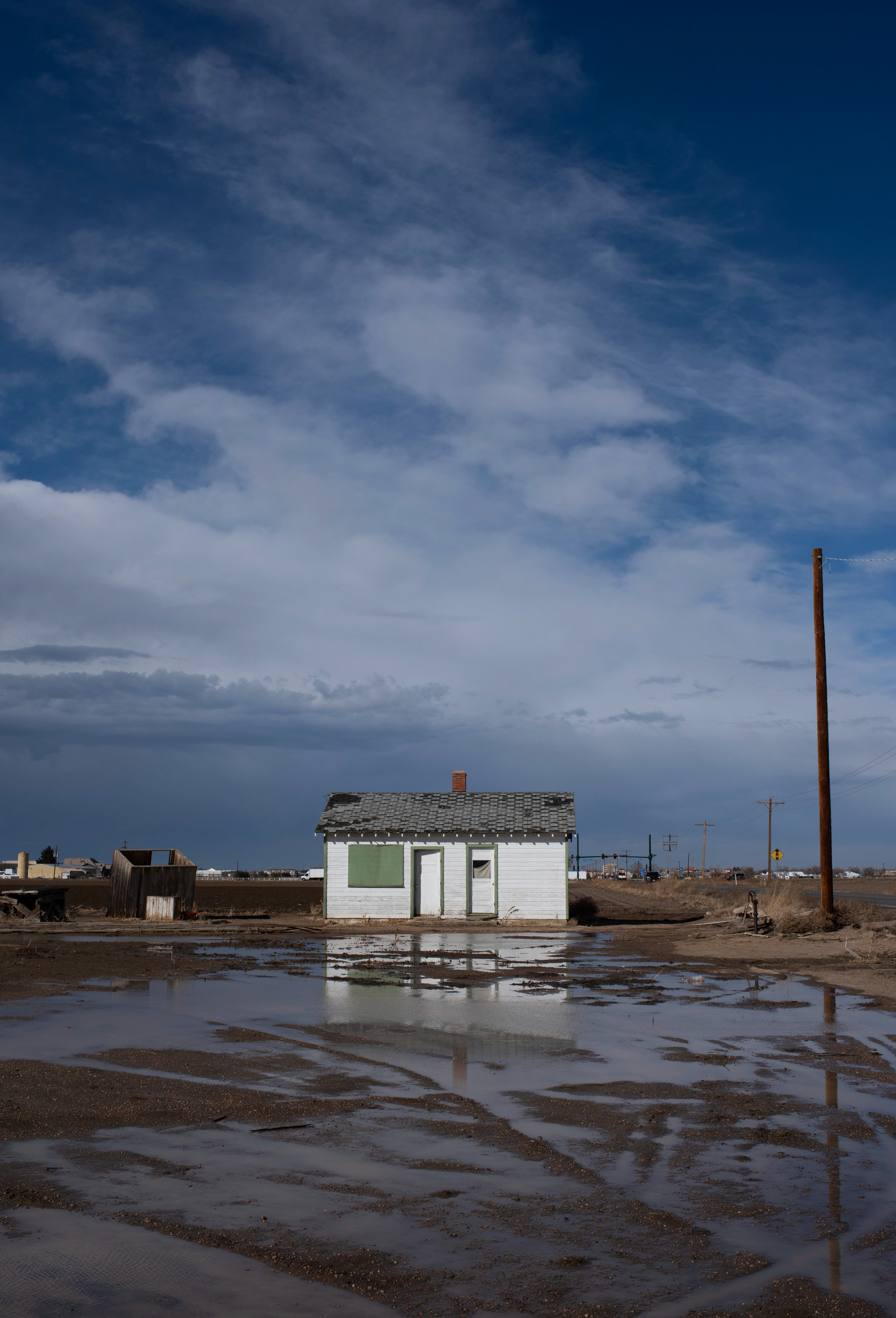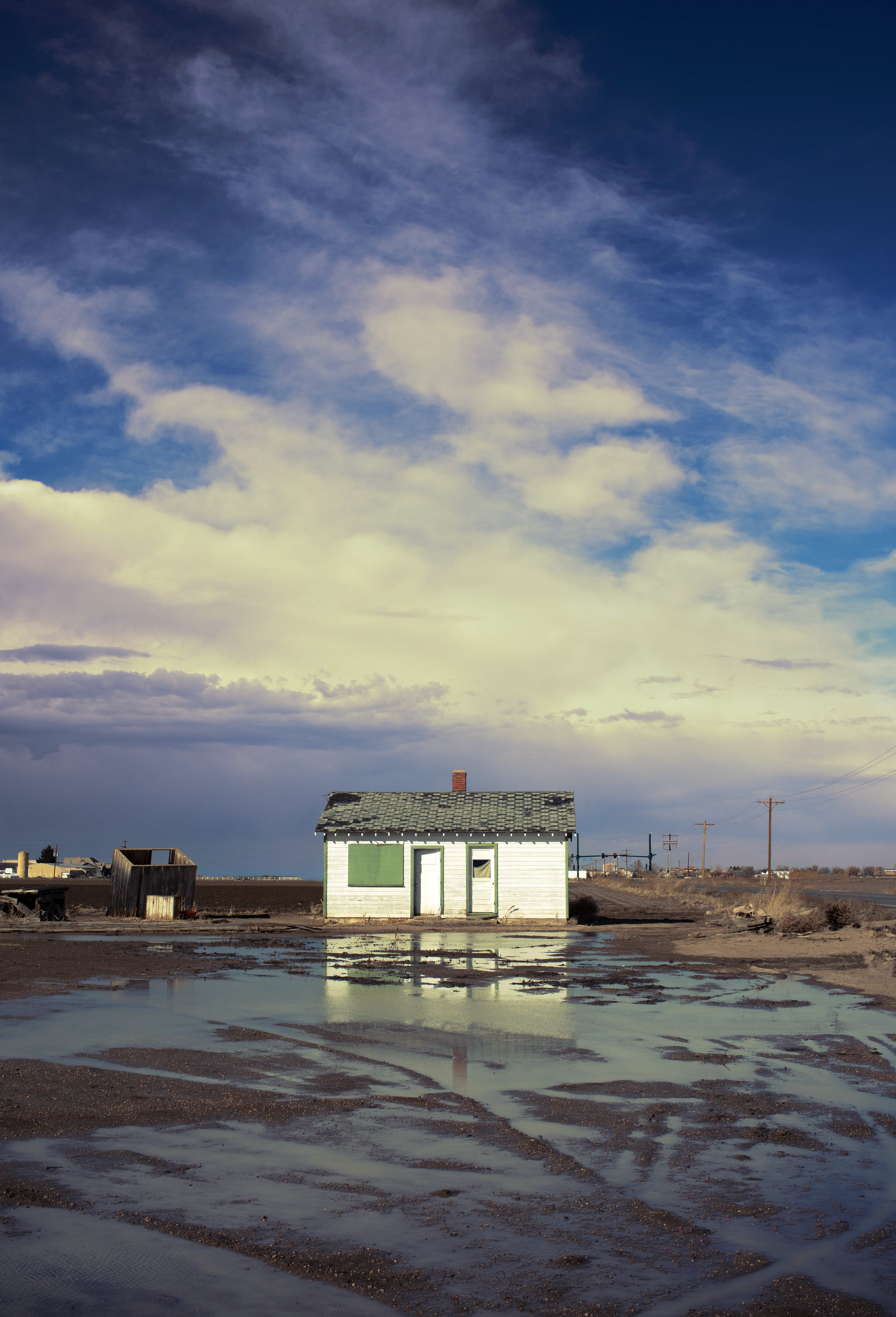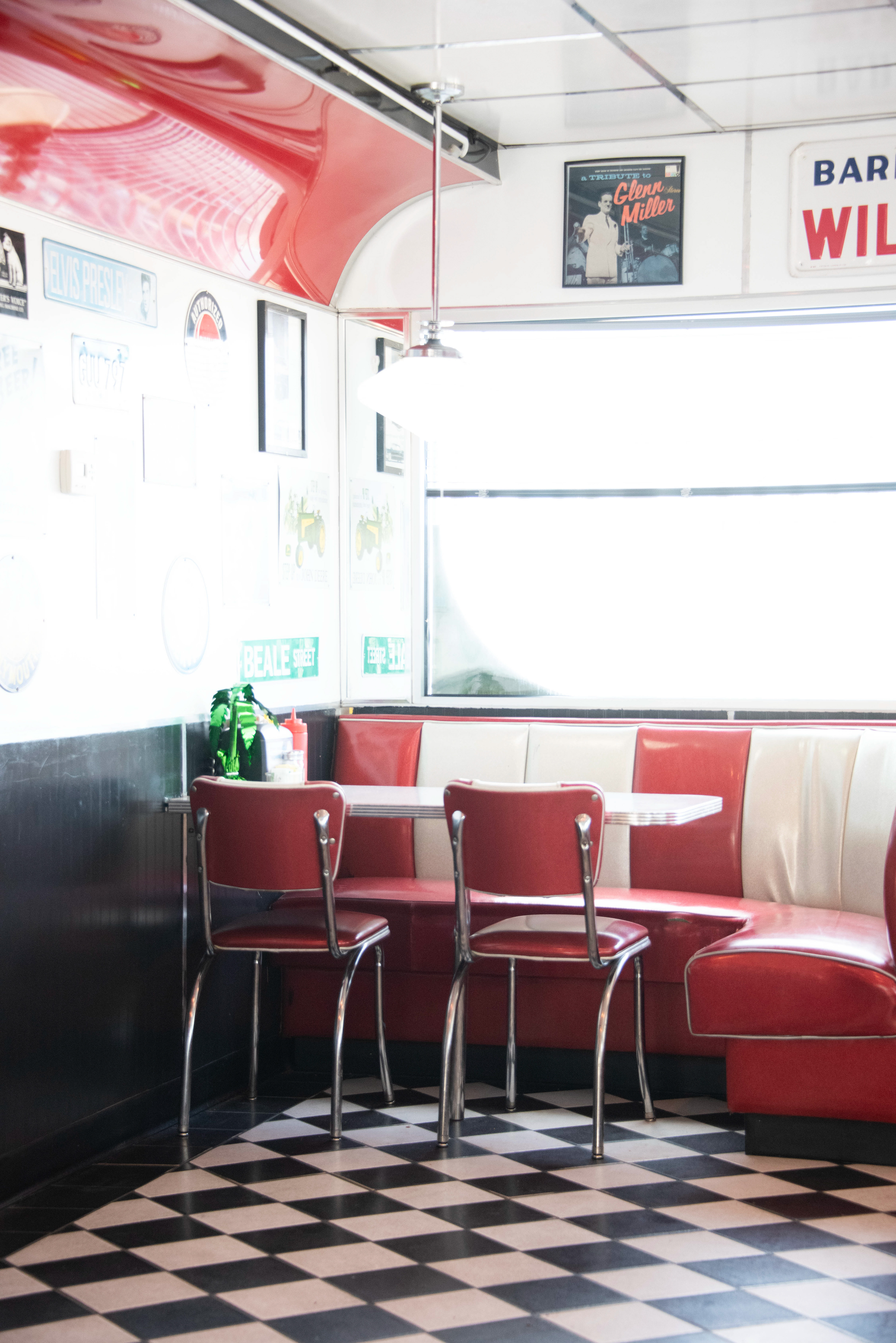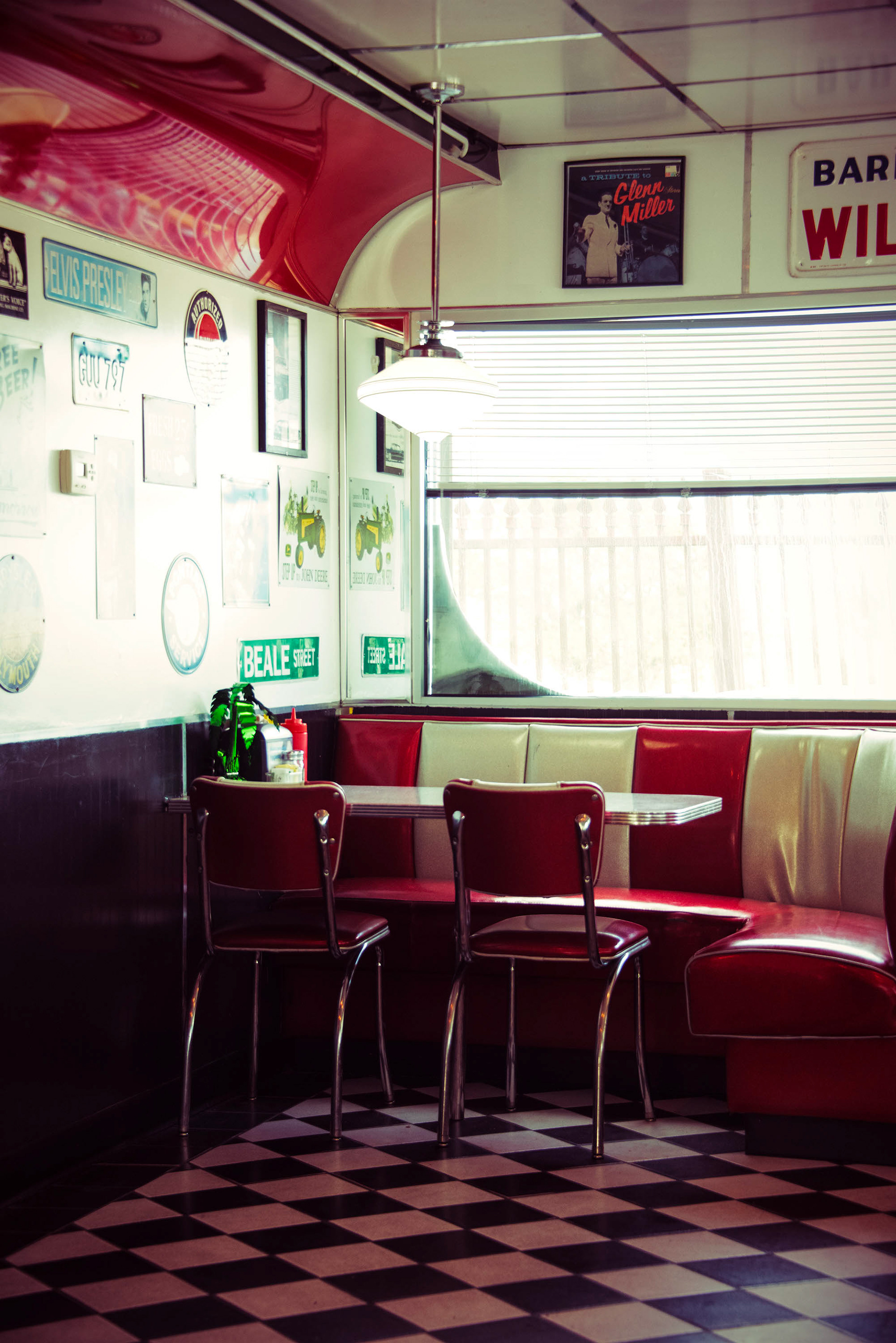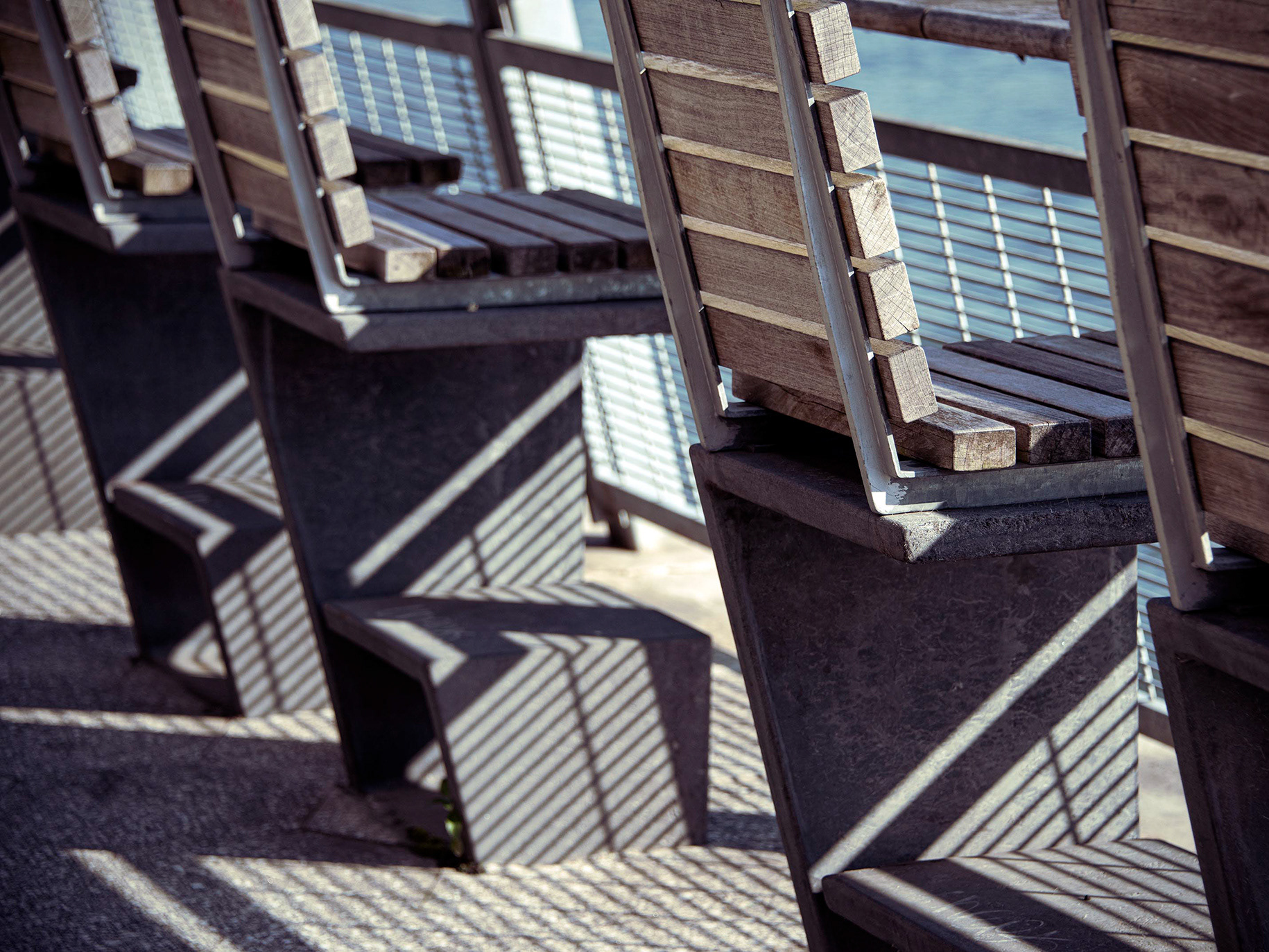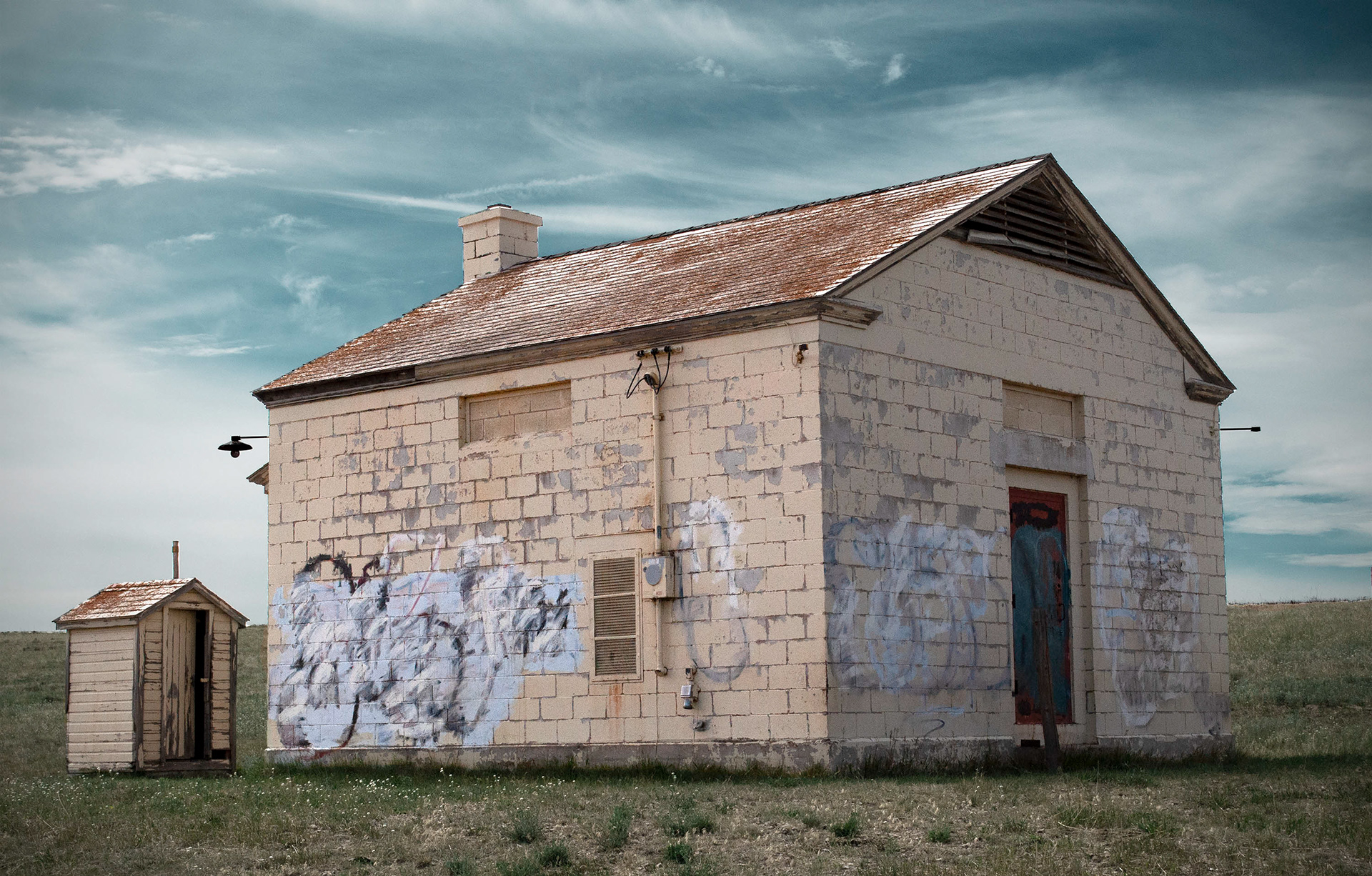
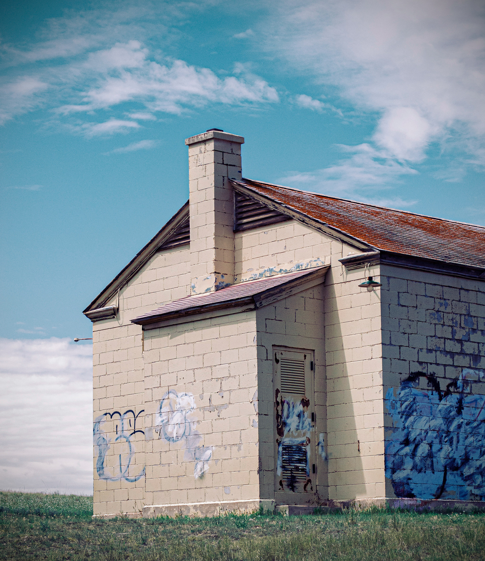
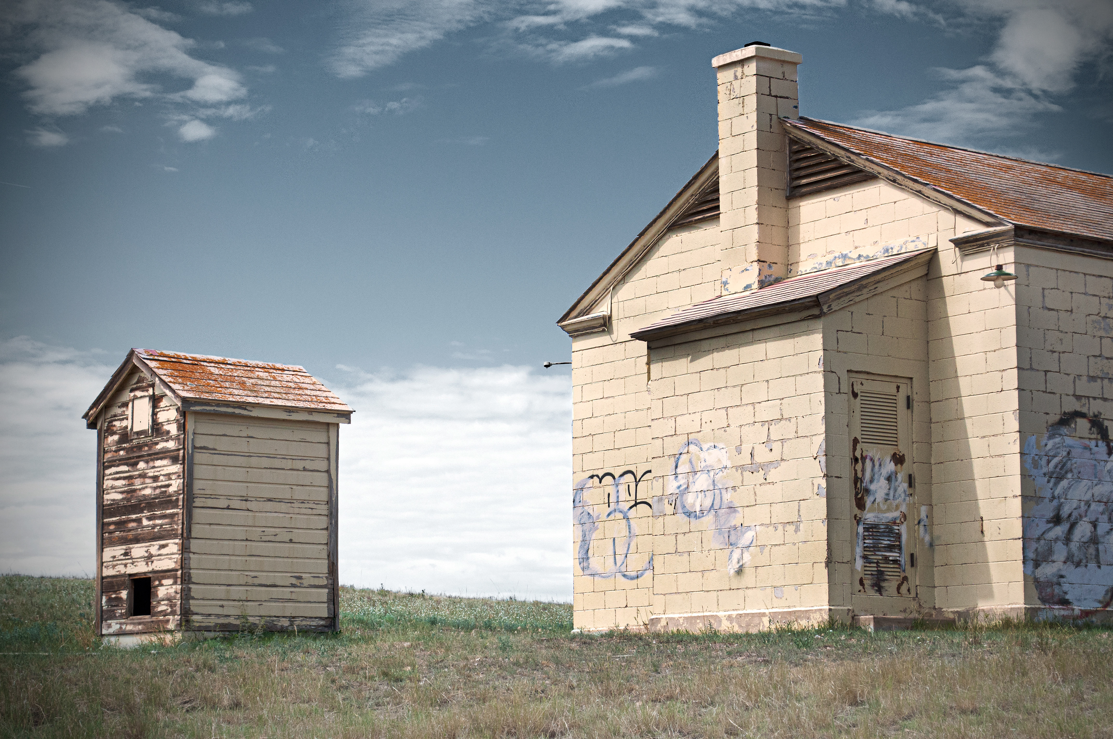
'Exit 167' - Digital - 2022 - Three sets of compositional and editorial choices made with the same subject.
In each rendition, I came to separate conclusions on the colors of the sky and grass, tonal values, and more. I eventually decided that #3 was the strongest—its grey sky and overall low saturation emphasize the gloomy, nostalgic feel of the abandoned buildings. Its composition feels balanced and works well with the natural focal points created by the sunlight shining upon the left side of the structures. In my mind, the larger building is imposing upon the smaller one, like a strict parent isolating their child. I also think this shot draws the most attention to the total emptiness of rural Colorado.
I love how the images (especially the second and third) have such drastically different auras; a clear example of how decisions made in both shooting and editing are far more important than the subject itself.
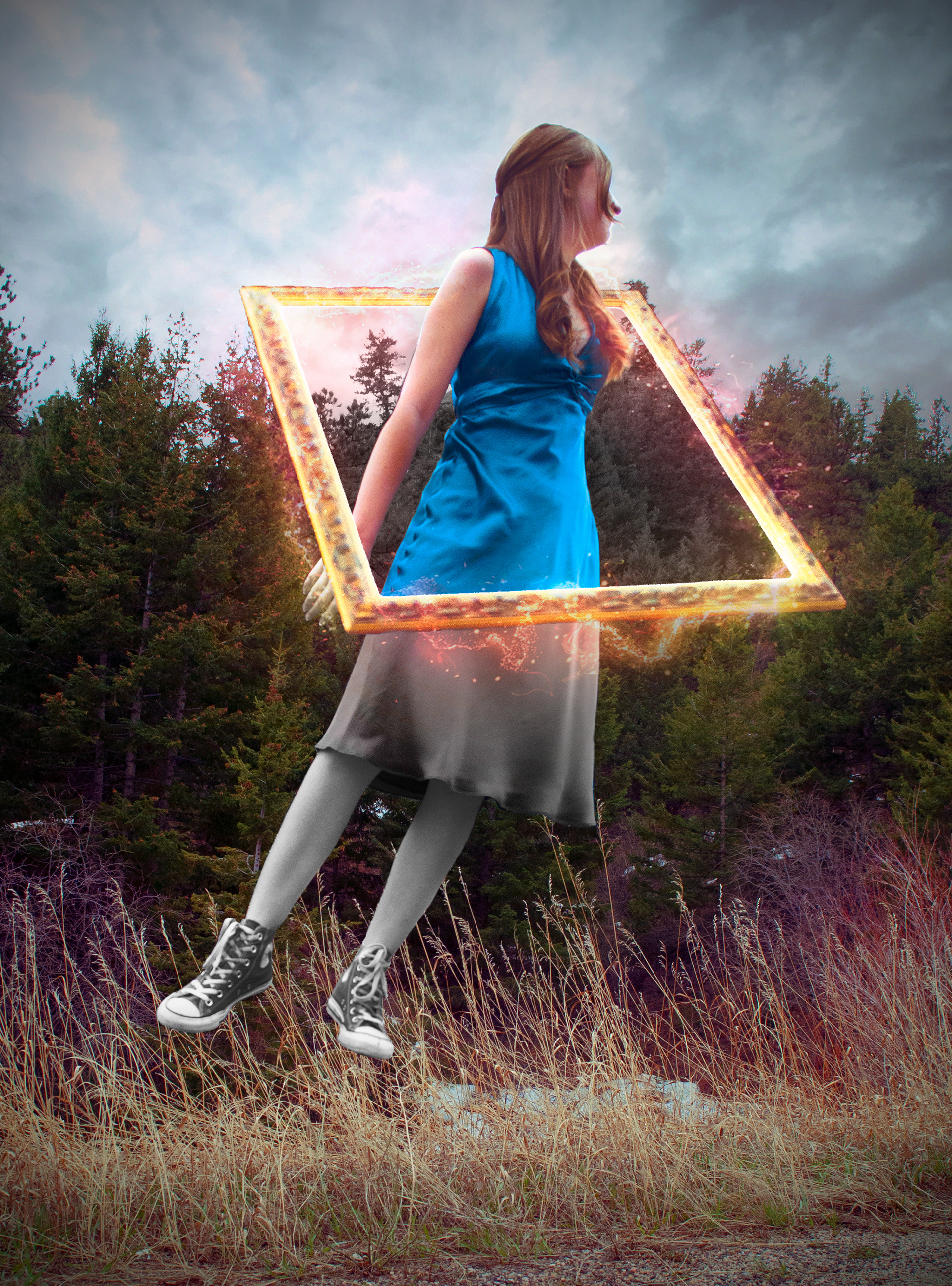
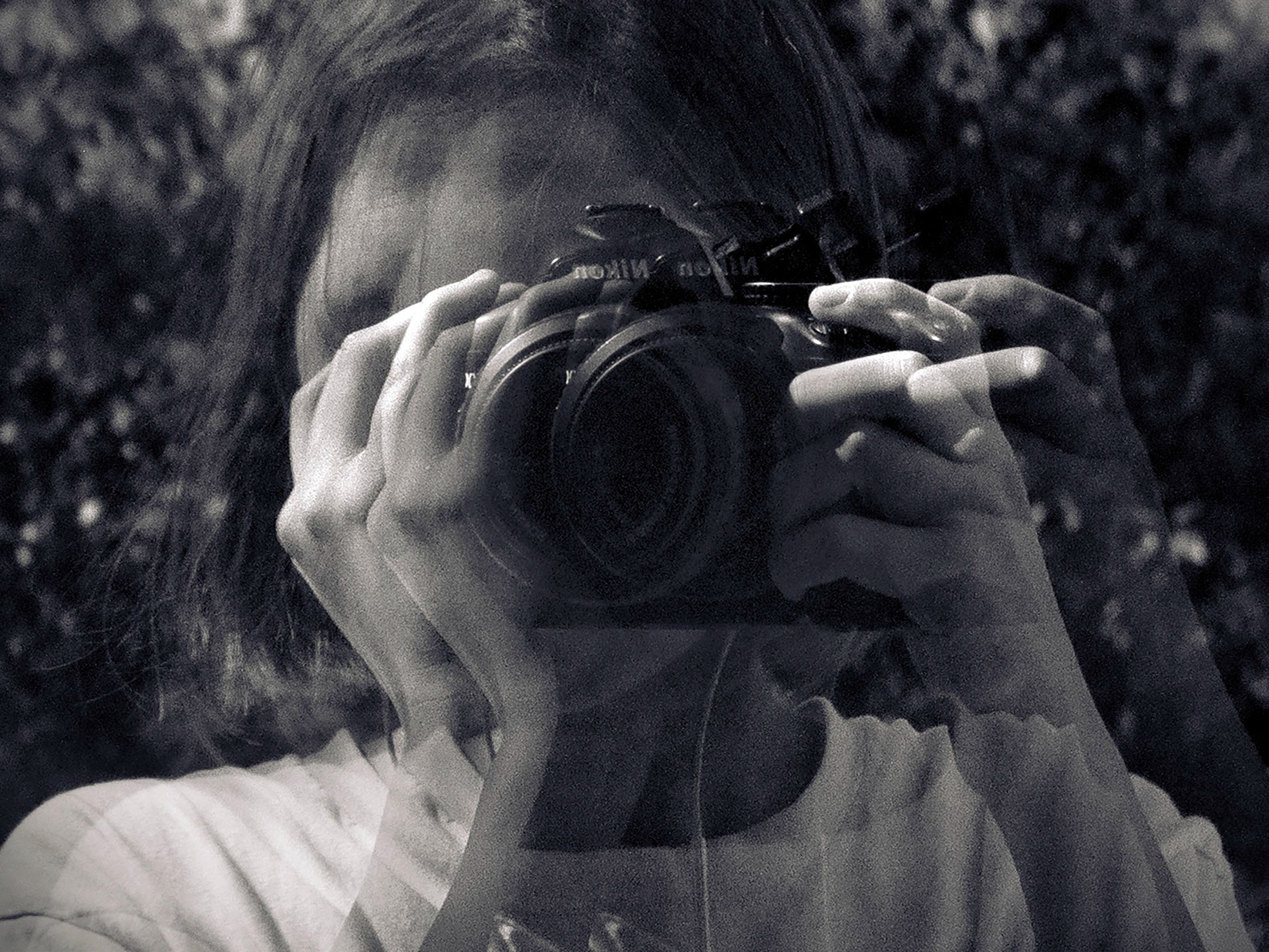
"And She Was" - Digital - 2022 - 10x13.5
For obvious reasons, this photo was probably the most editing-heavy endeavor I've ever undertaken. I think I spent around eight hours in Photoshop, combining four images.
Despite my meticulous planning, the final product wasn't anything like I had originally imagined. Photography is never entirely within the artist's control, after all. For example, the model, my sister, is wearing the dress that my mom wore to her junior prom. We came across the dress while frantically searching for an outfit just before driving to Boulder for the shoot. I begrudgingly agreed on the bright blue, although I'd been hoping for something more neutral in my color palate. I am so grateful that I made that concession; although I already had the portal incorporated, the vibrant dress inspired me to have the figure travel from a black-and-white world to one full of color. If everything had gone exactly my way, the final image might not have turned out as magical as it did.
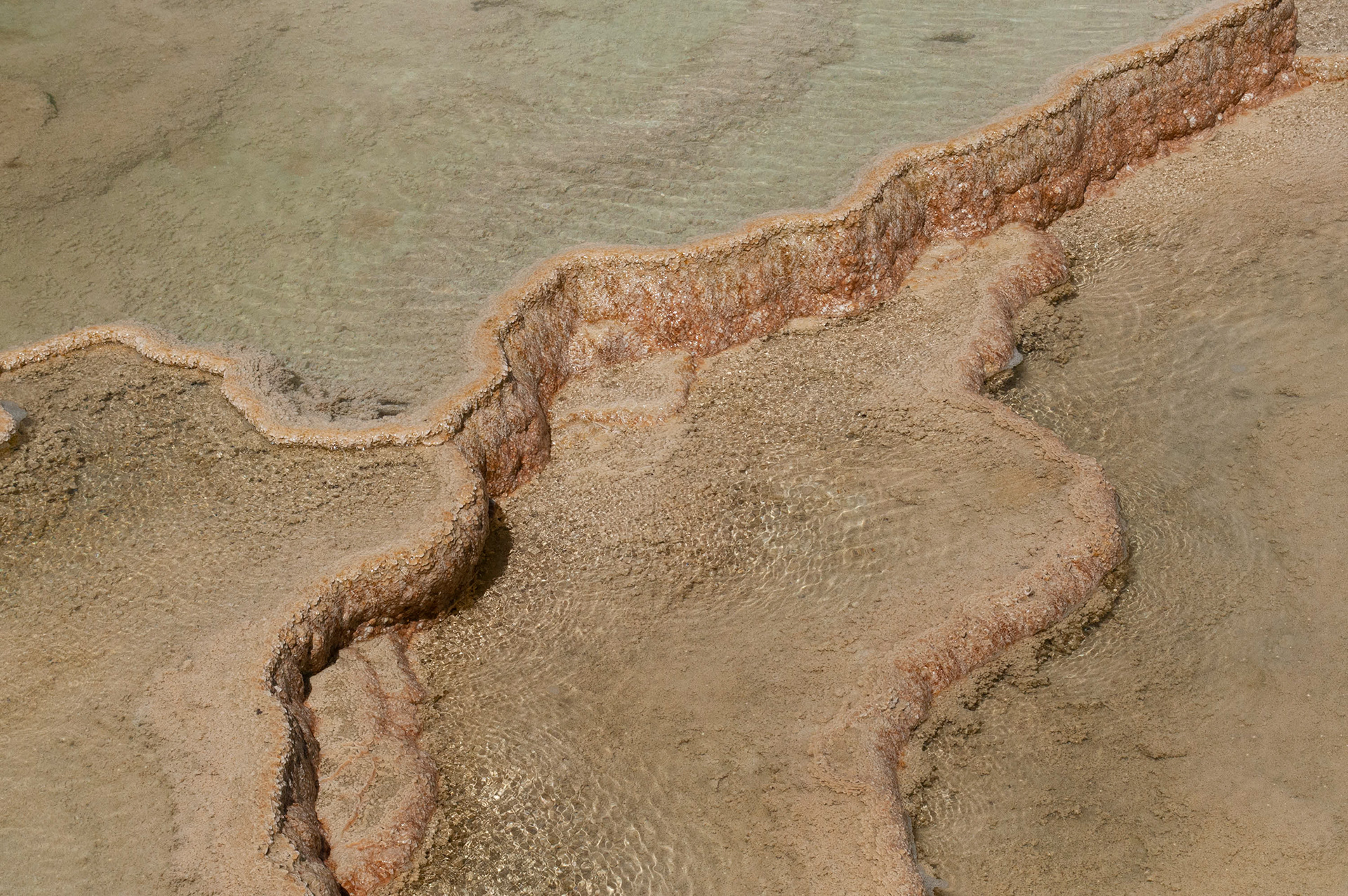
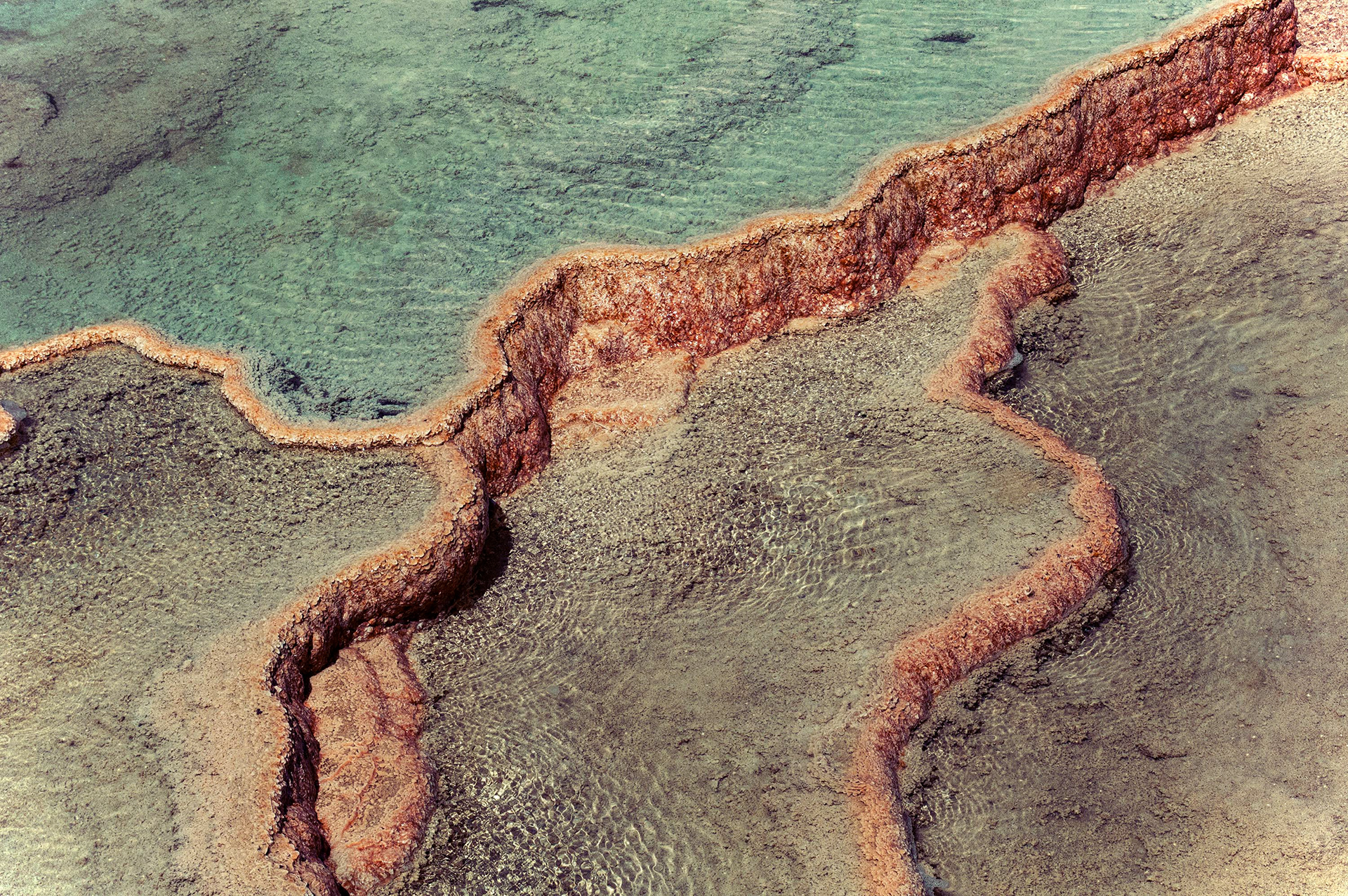
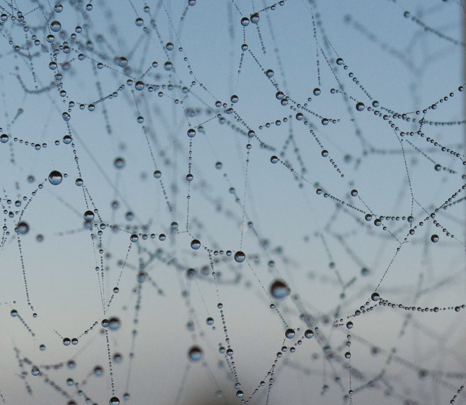
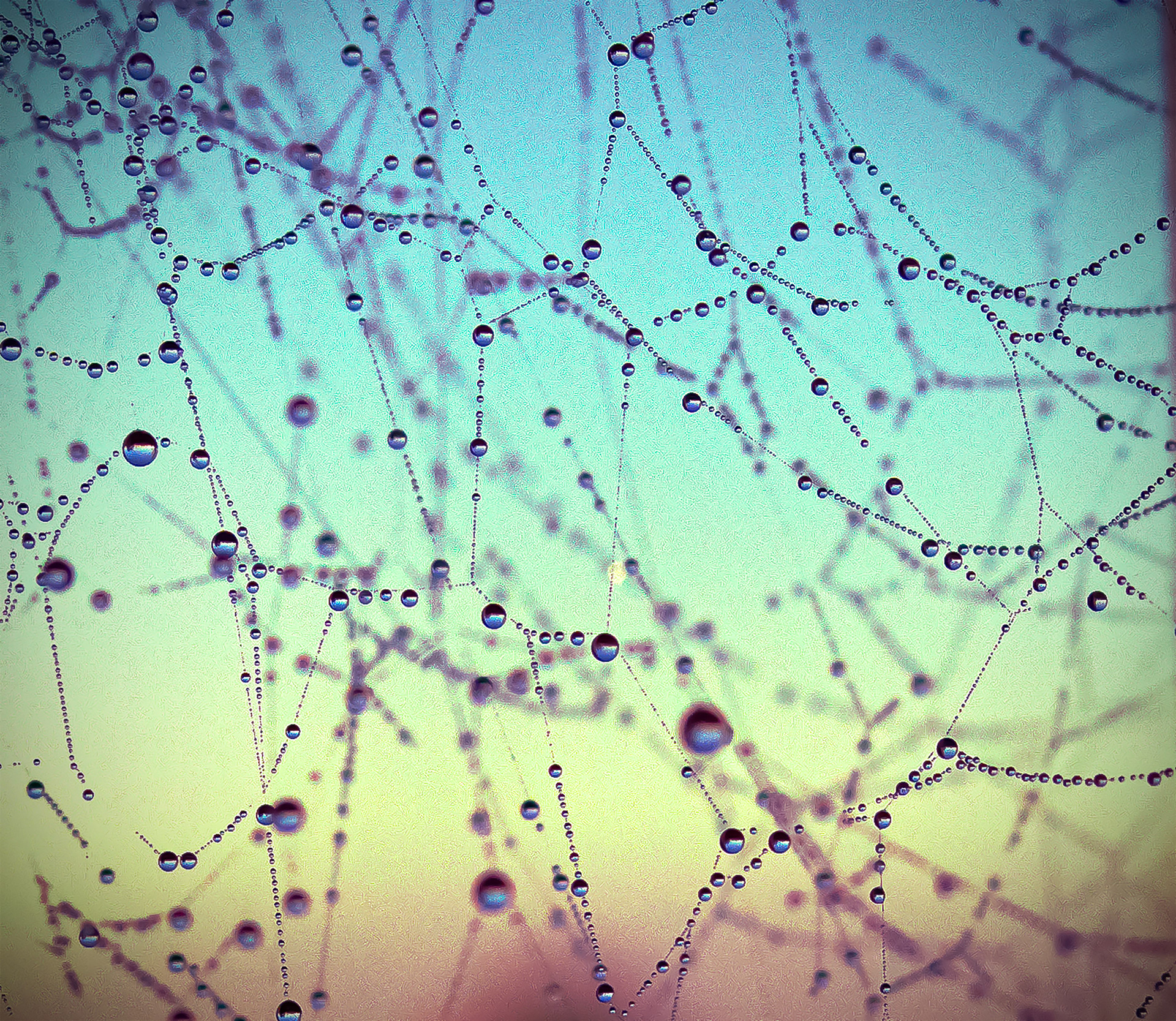
"Mammoth" - Digital - 2022 - 12x8 - Unedited vs. Edited
Occasionally, I edit a photo and find the result so satisfying that I can't stop flipping back and forth between the edited and unedited versions and admiring the changes. This was one of those images. The original version had practically no color. I invented the crystalline blue water and firey stone color, plus the purplish shadows that are a staple of my personal style and use of color (you'll find similar tones on the tree trunks in "And She Was" and in the second iteration of "Exit 167", for example). I also used a reverse vignette on this photo, accentuating the light disturbed in the water ripples.
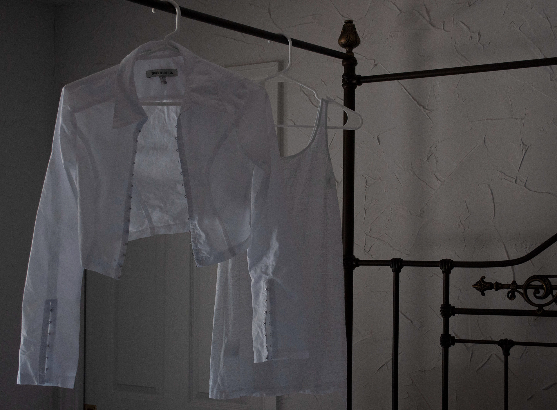
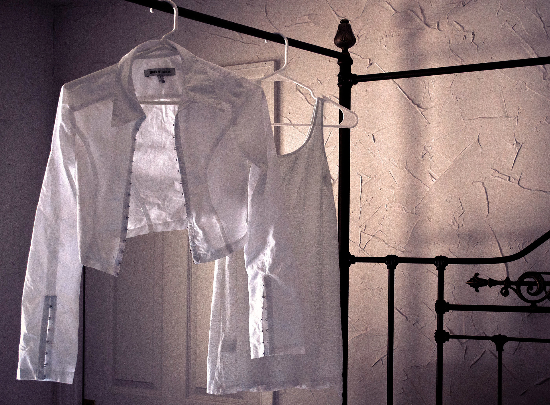
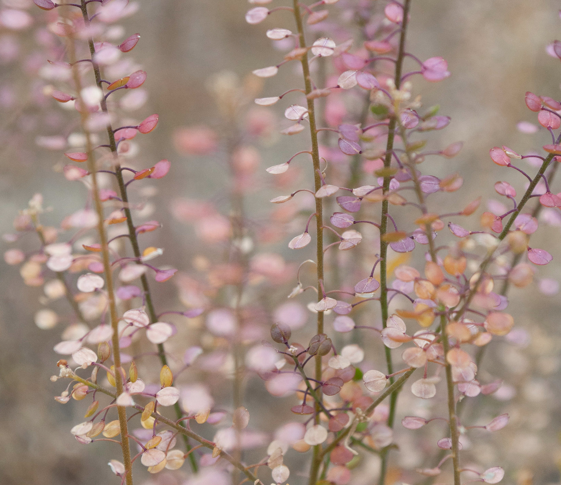
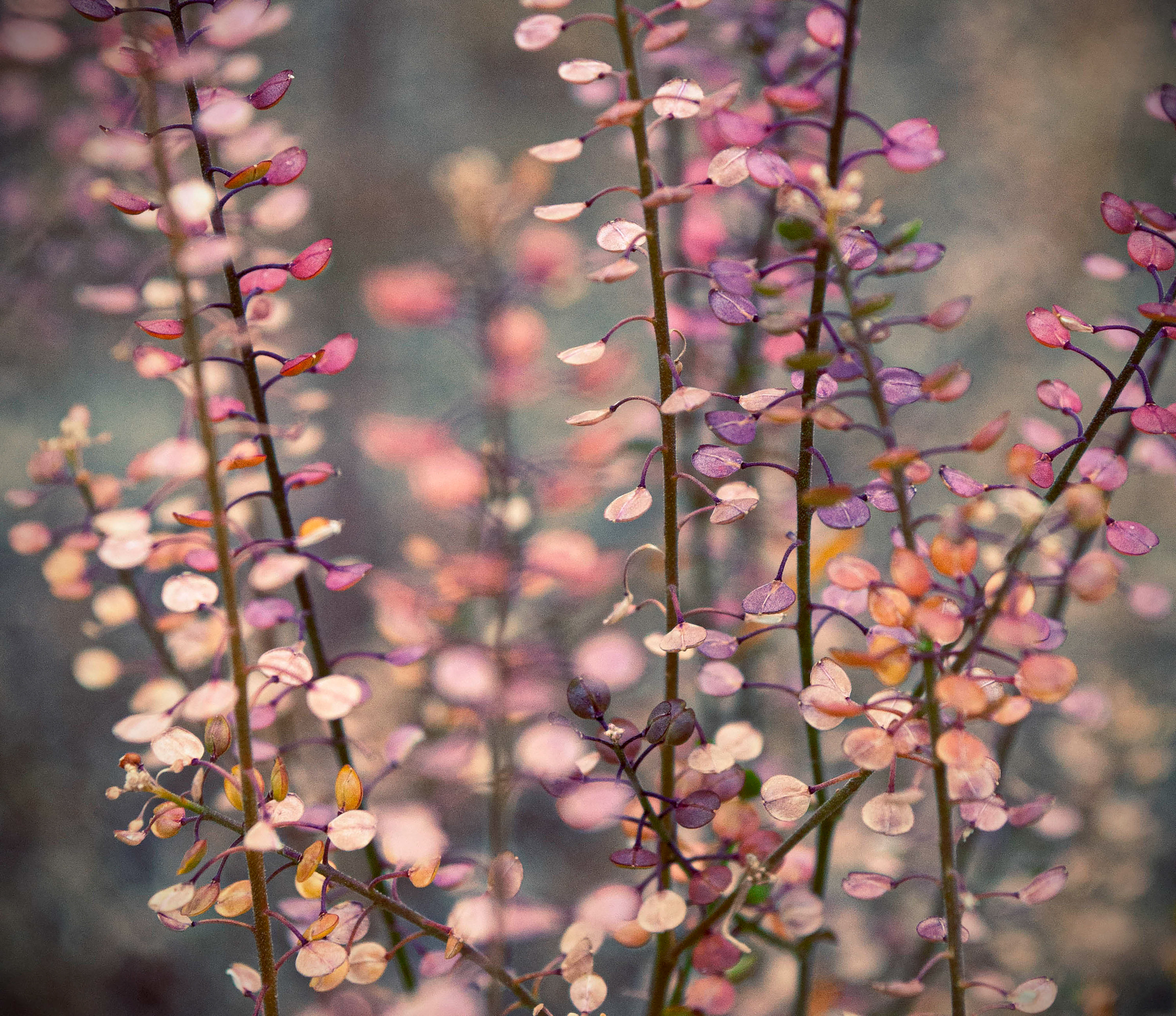
Before and After Gallery